Corporate identity is a very important component in the survival and thriving of any organization. Advertising agencies have charged millions to create, refine and update the images of big corporations. Following many design drafts, executive meetings and focus groups, a new logo emerges and rebrands a corporation allowing it to better relate to its target audience. It is truly a great synthesis of art and science, and as a marketing strategy, it almost always results in a better exposure and a broader reach!
Occasionally, the culture grabs hold of a new image and for various reasons not always immediately clear to the public, the symbol quickly becomes popular. Within weeks and sometimes days, we see the image on posters, the Internet, T-shirts, cards, bracelets, banners, etc.
 In light of all that, I noticed that the Muslim Brotherhood recently decided to rebrand itself. Clearly, they did not go on rooftops to trumpet their rebranding, yet they managed to peek the interest of many. Early adopters of the new symbol are now being joined by thousands worldwide. This “cool’ and “hip” new hand signal known as R4BIA (say: RABIA but replace the first A with the digit 4) is spreading like wildfire.
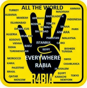
It is some sort of a salute with four fingers extended out and with the thumb folded back inside the palm. It is believed that it originated with the pro-Morsi protesters in support of deposed Egyptian President Mohammed Morsi. But it might have also originated from Turkey. Rabia means four or fourth in Arabic.
According to Ms. Dawn Perlmutter who is considered a leading expert in the areas of religious terrorism and ritualistic crimes,
” The design of the symbol has been endowed with characteristics of the sacred in Islam: the color yellow used in the background signifies the golden Dome of the Rock in Jerusalem and the hand depicted in the color black denotes the black cloth that covers the Kaaba.
… Although the R4BIA symbol may have originally signified solidarity with massacred protesters, the meaning and the imagery has rapidly been radicalized to embody the primary concepts of Islamist propaganda: honor, heroism and martyrdom in the goal of establishing an Islamic caliphate. Images of the R4BIA symbol now include the fingers being depicted as rifles, the hand holding the black flag of jihad and writing on the hand calling for an Islamic Caliphate.” (as quoted by Middle East Forum).
So the R4BIA logo, which by the way is rapidly becoming a movement, is a far cry from a “hip” symbol declaring unity in protest towards freedom. As a matter of fact, if one is to visit their website, it will not take long to discover a hidden–or not so hidden agenda. It even has a song attached to it. It is important to understand that the lyrics of the song were penned by Egyptian professor and activist Sayyid Qutb, a key leader of the Muslim Brotherhood in prison from 1954 to 1966. He also published the virulently antisemitic work Our Struggle Against the Jews in 1950. To many Muslims, Qutb is the epitome of Islamic martyrdom.
If we look at the list under “What is R4BIA”?, buried in a sea of social justice clichés and tag lines are some statements that carry no ambiguity whatsoever. Here are some out of the 39 statements:
• R4BIA is the return of Muslims to world stage
• R4BIA is Egypt, Syria, Palestine and the whole geography of Islam
• R4BIA is the place of people who show the death is a revival
• R4BIA is justice for everyone against rotten Western values
• R4BIA is a pure martyrdom
• R4BIA is the end of Zionists
We ought to exercise caution when we choose to display certain symbols, colors and/or garments. After all, we might not be “what we wear”, but we are at the very least “what we declare”. In the case of R4BIA, and under a thin veneer of social justice, we declare our solidarity with the Muslim Brotherhood and their agenda. It is our responsibility to let others know about this devious rebranding of a very dangerous organization committed to the destruction of Western values and of Israel.
sad but true